Let’s Talk

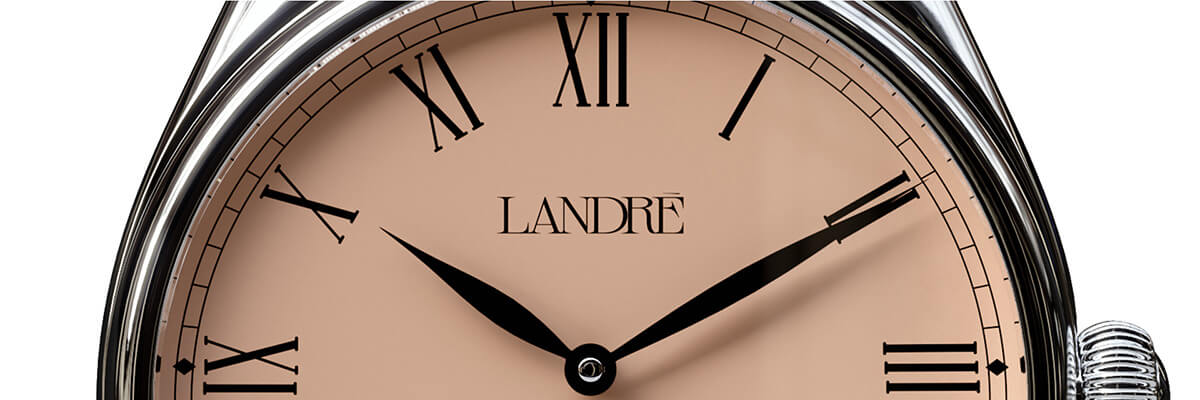
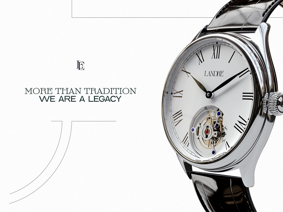
Landré is a new brand of analog wristwatches characterized by the use of the Tourbillon, a mechanism that improves precision and it’s a symbol of status in the haute horlogerie. The company was born of a fascination for watchmaking and craftsmanship. Its mission is to create a product that offers high quality at an affordable price.
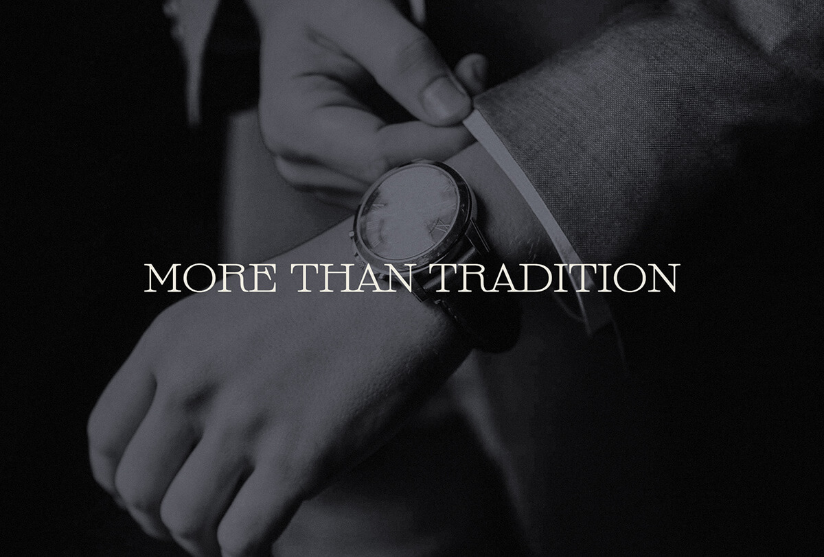
They approach their products in luxury, not from opulence and excess, but from sobriety and attention to detail.
To design a classic and elegant visual identity, without losing sight of the brand's modernity.
For the logo, a serif typeface was used with long serifs and diagonal angles, which helps to accentuate the strong personality of the brand. The "L" and "E" is a recognizable icon for the brand, and the understated color palette reinforces the elegant nature of the company and its products.