Objective
To build a distinctive and recognizable brand within the cannabis accessories market, developing a clear strategic foundation, a compelling identity, and a cohesive experience across products, packaging, communication, and e-commerce.
Solution
We developed the brand strategy around accessibility, community, and a confident urban personality. The name Hitters and the creative platform “Hits Better” established a direct and memorable verbal identity, bringing a distinctive attitude to the brand's communication.
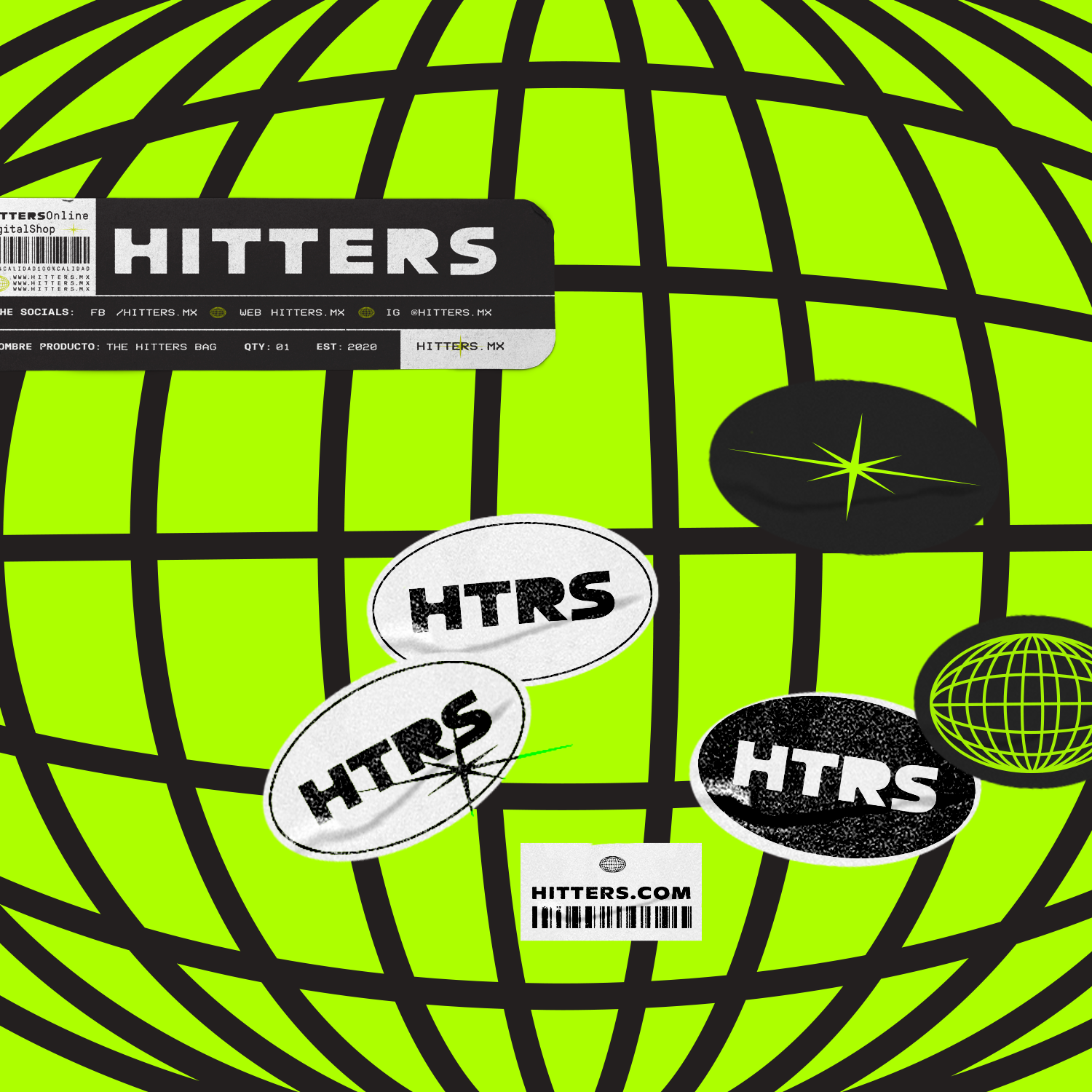
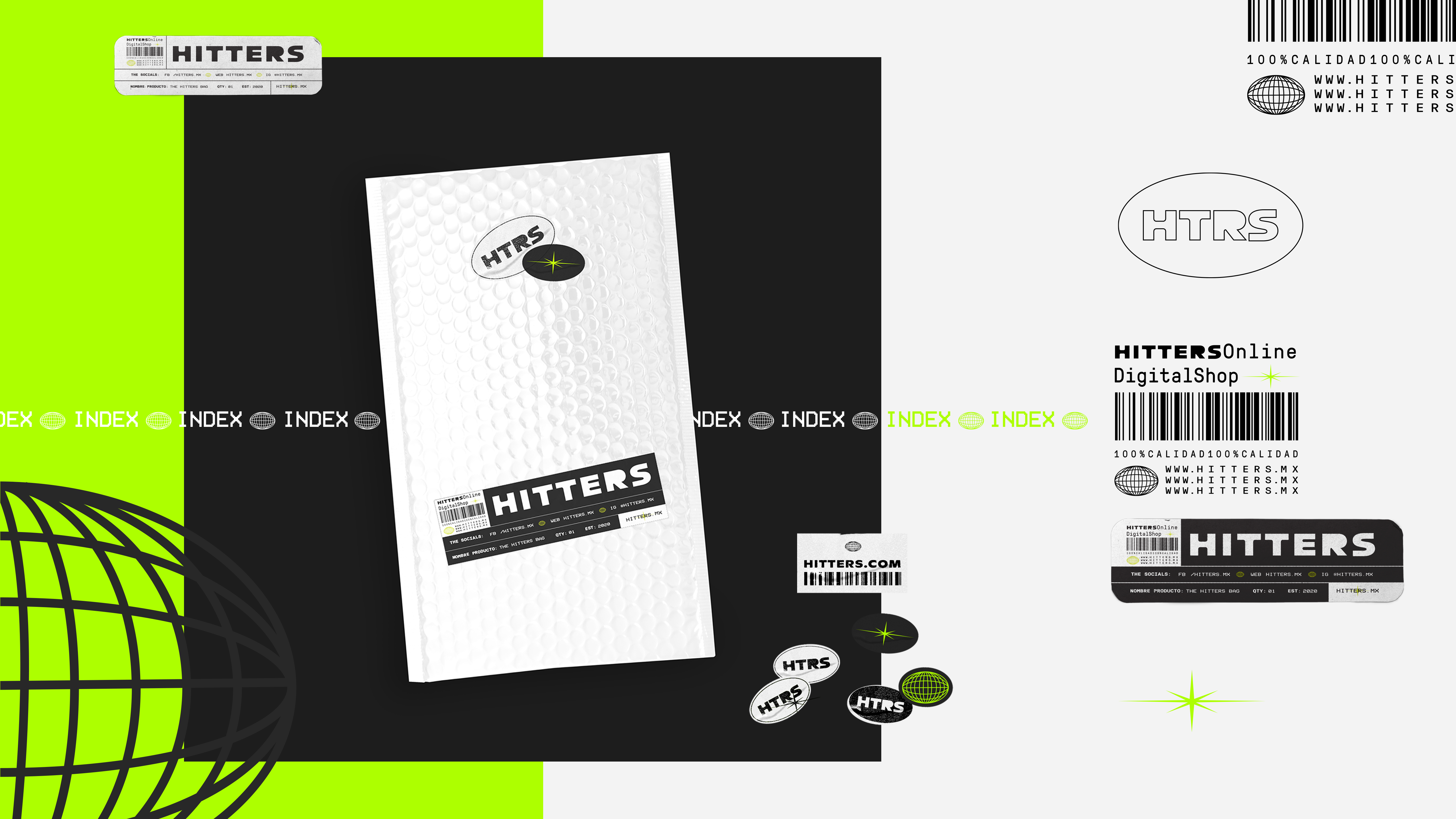
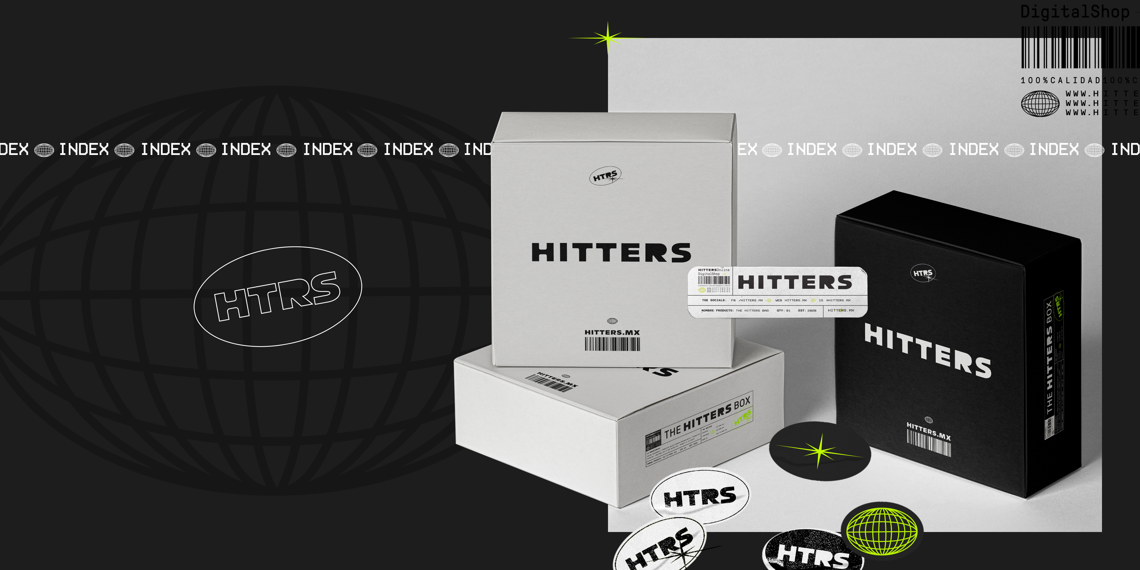
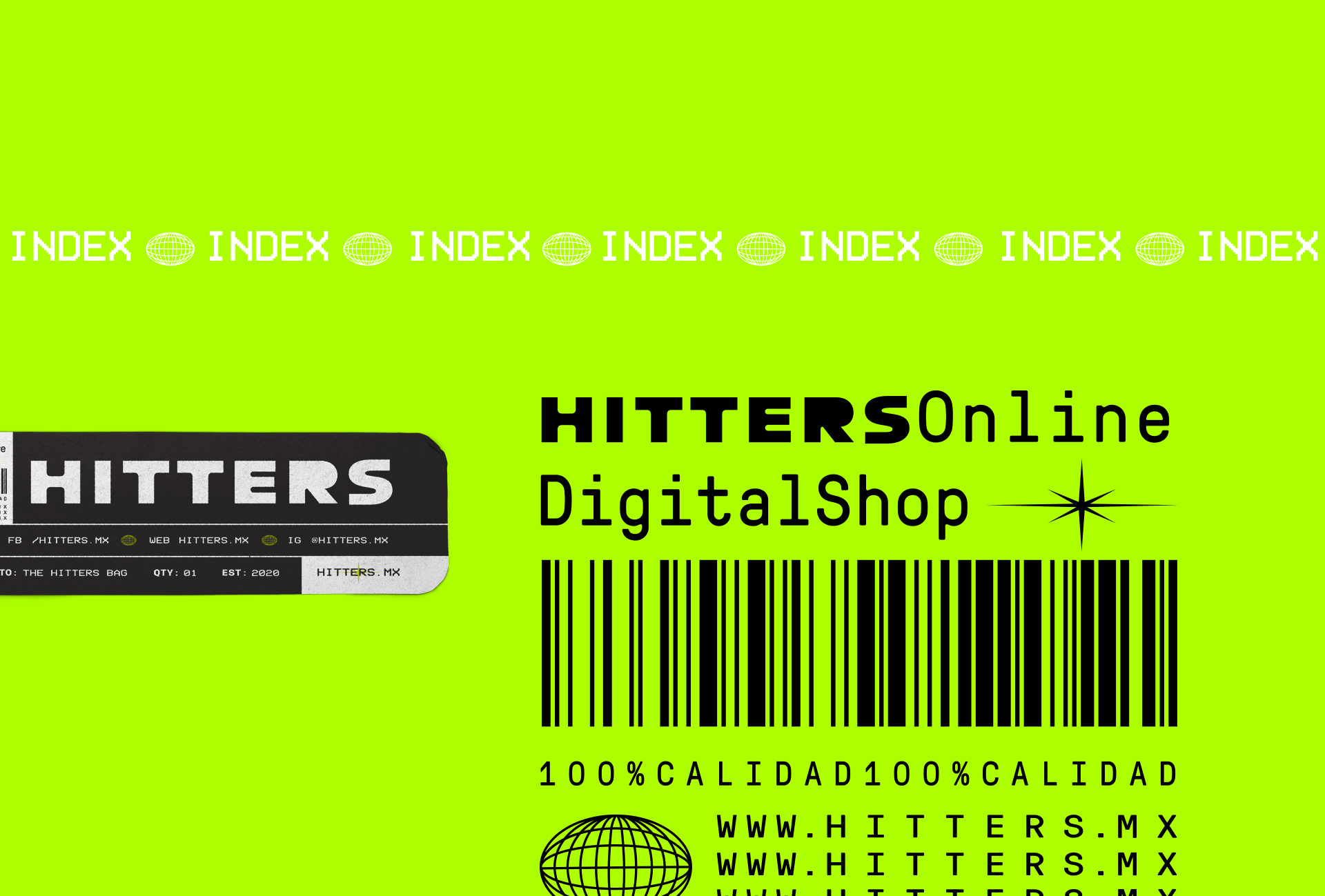
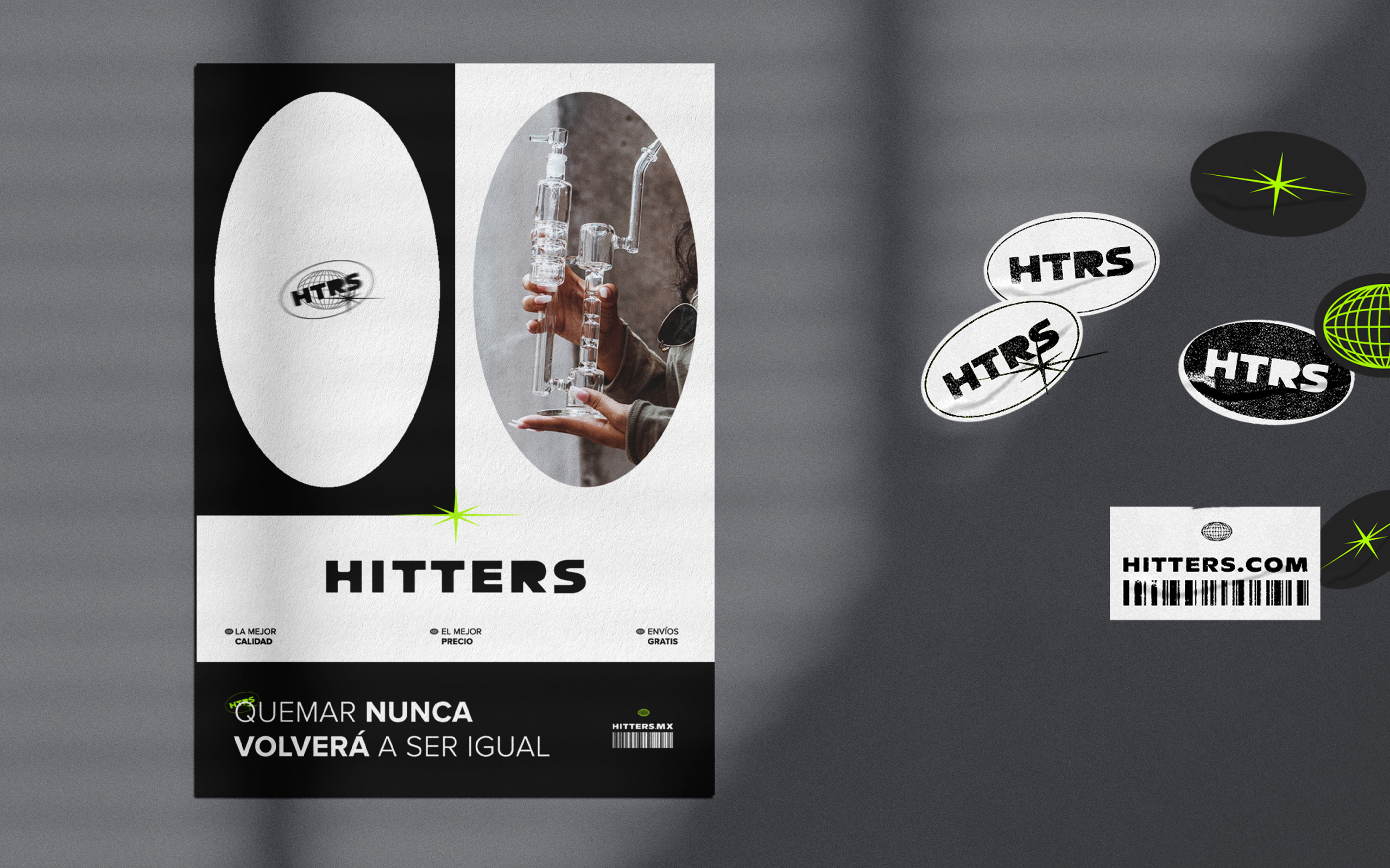
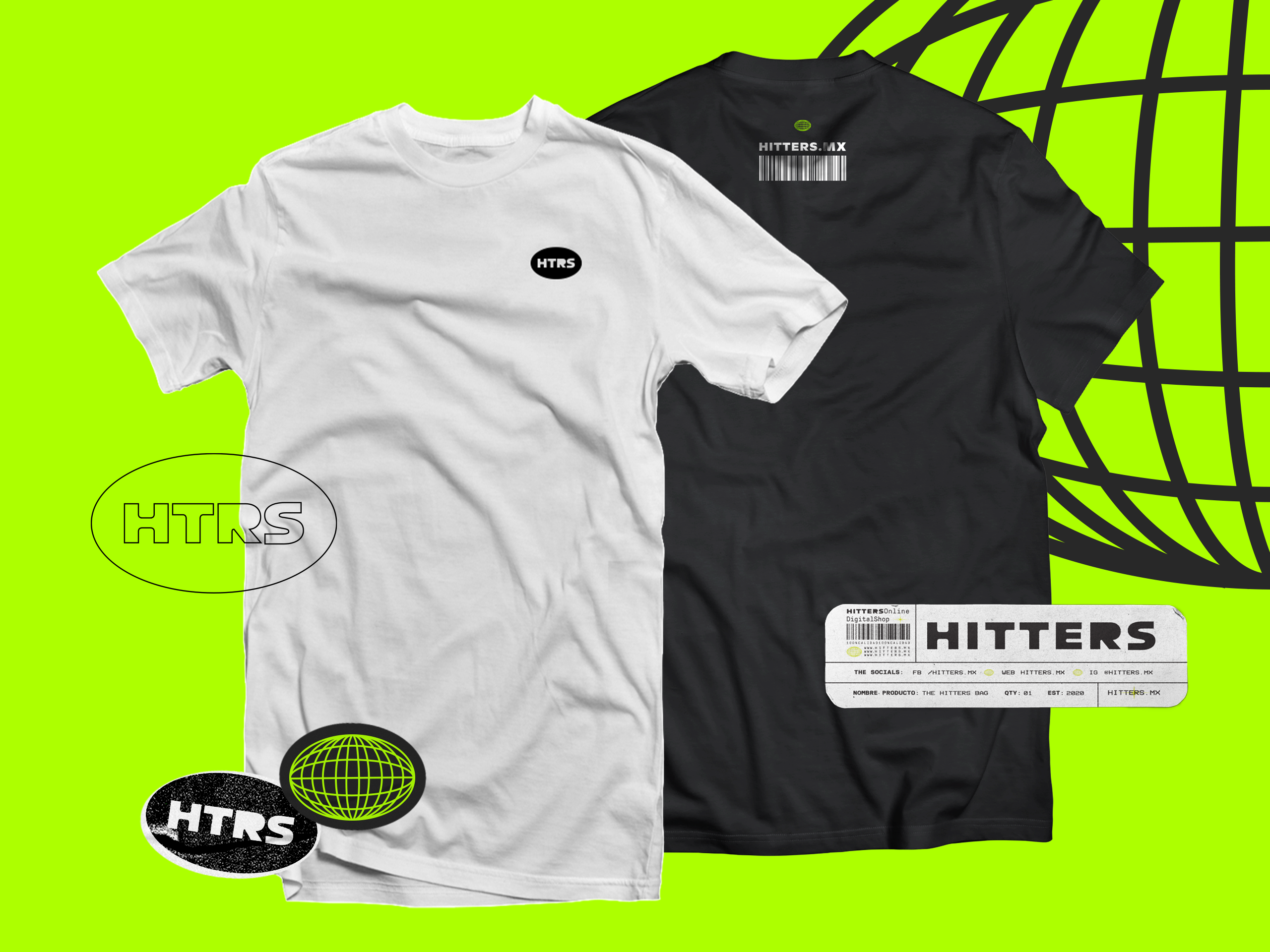
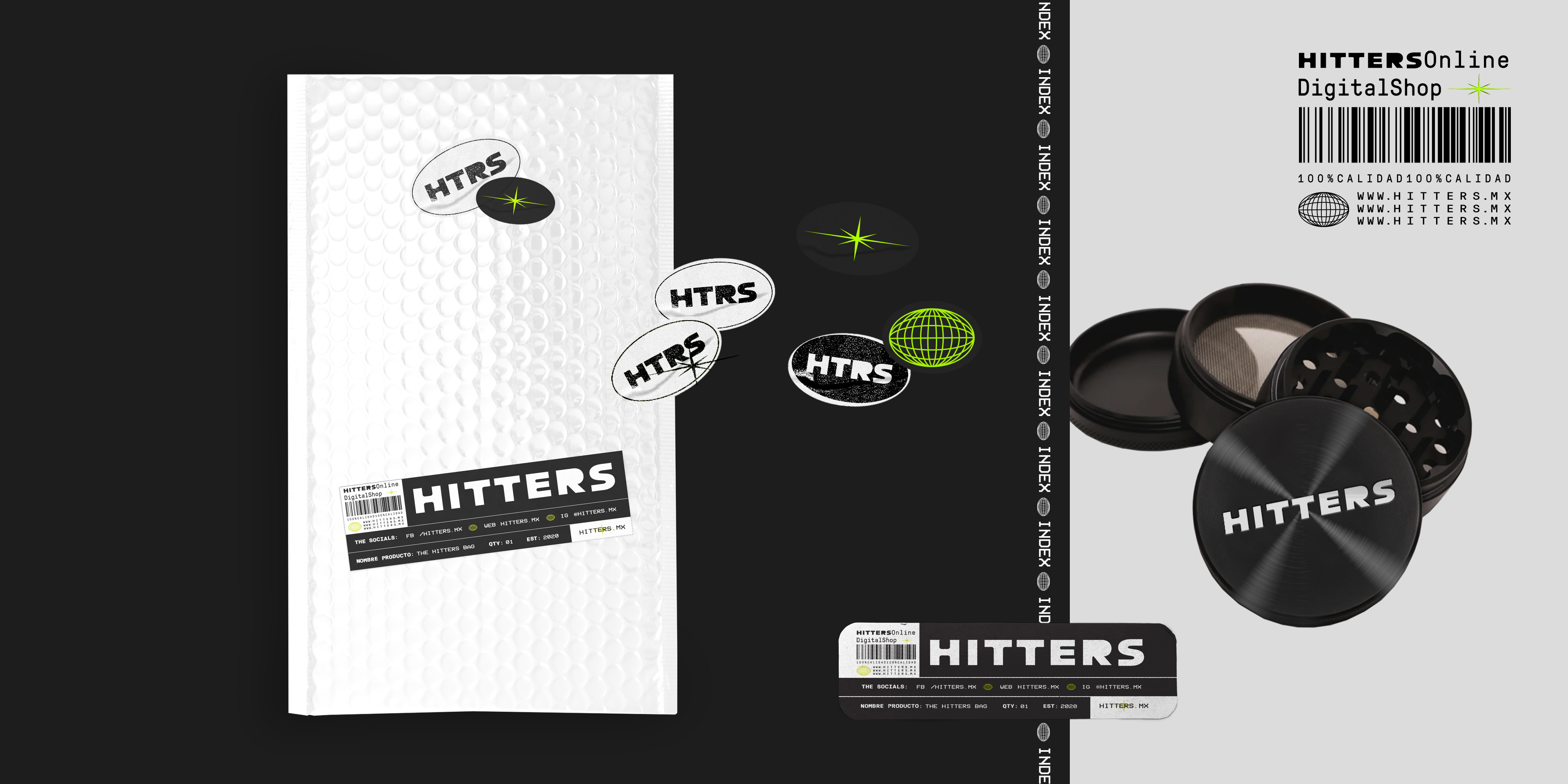
The visual identity is built around a bold sans-serif logotype, complemented by graphic elements and patterns derived from its typography. A palette of dark tones and vibrant greens reinforces its energetic, contemporary character, creating a flexible and recognizable visual language.
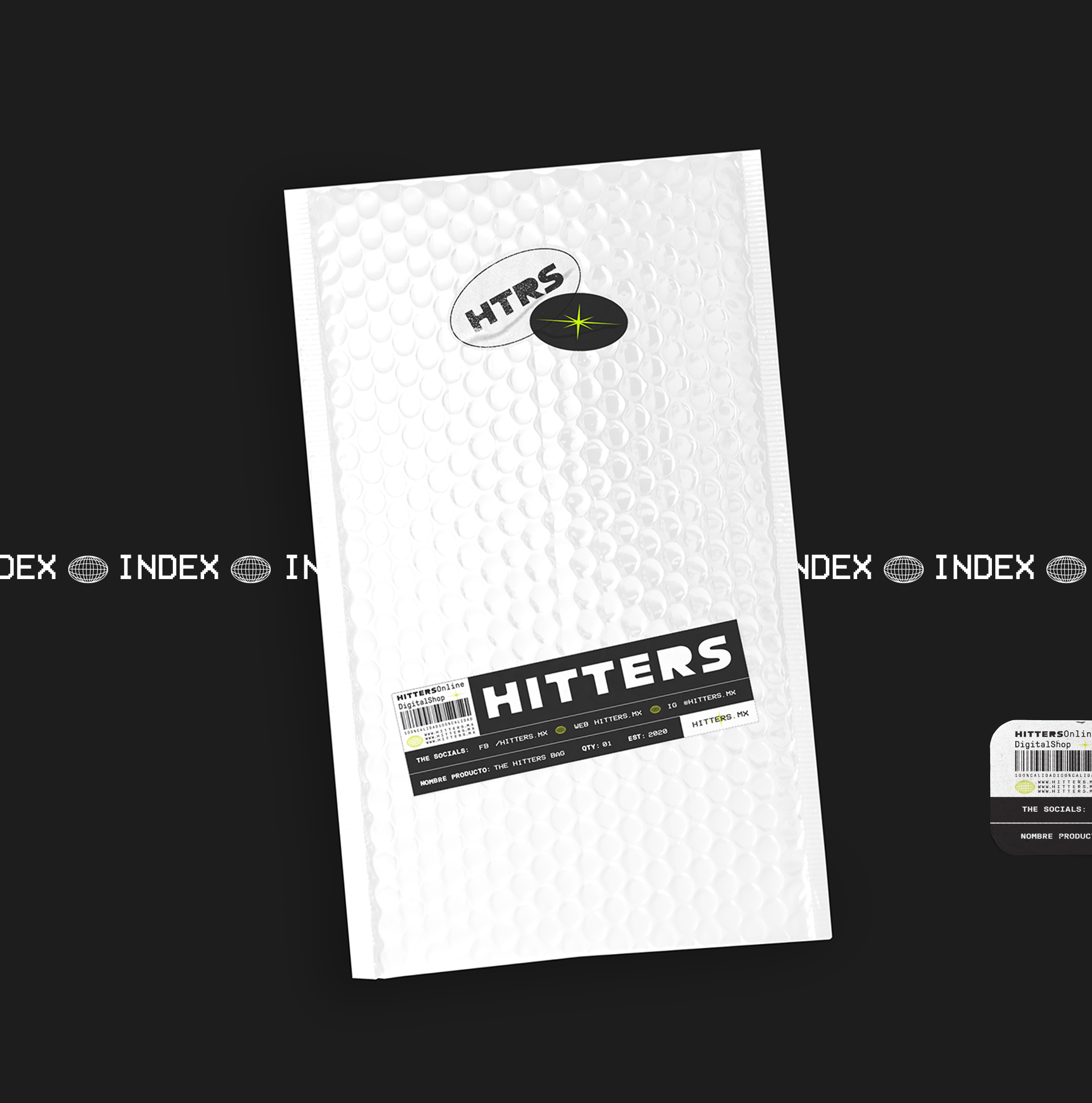
We extended this identity across product packaging, shipping materials, advertising, and merchandise, establishing consistency throughout the brand's physical touchpoints.
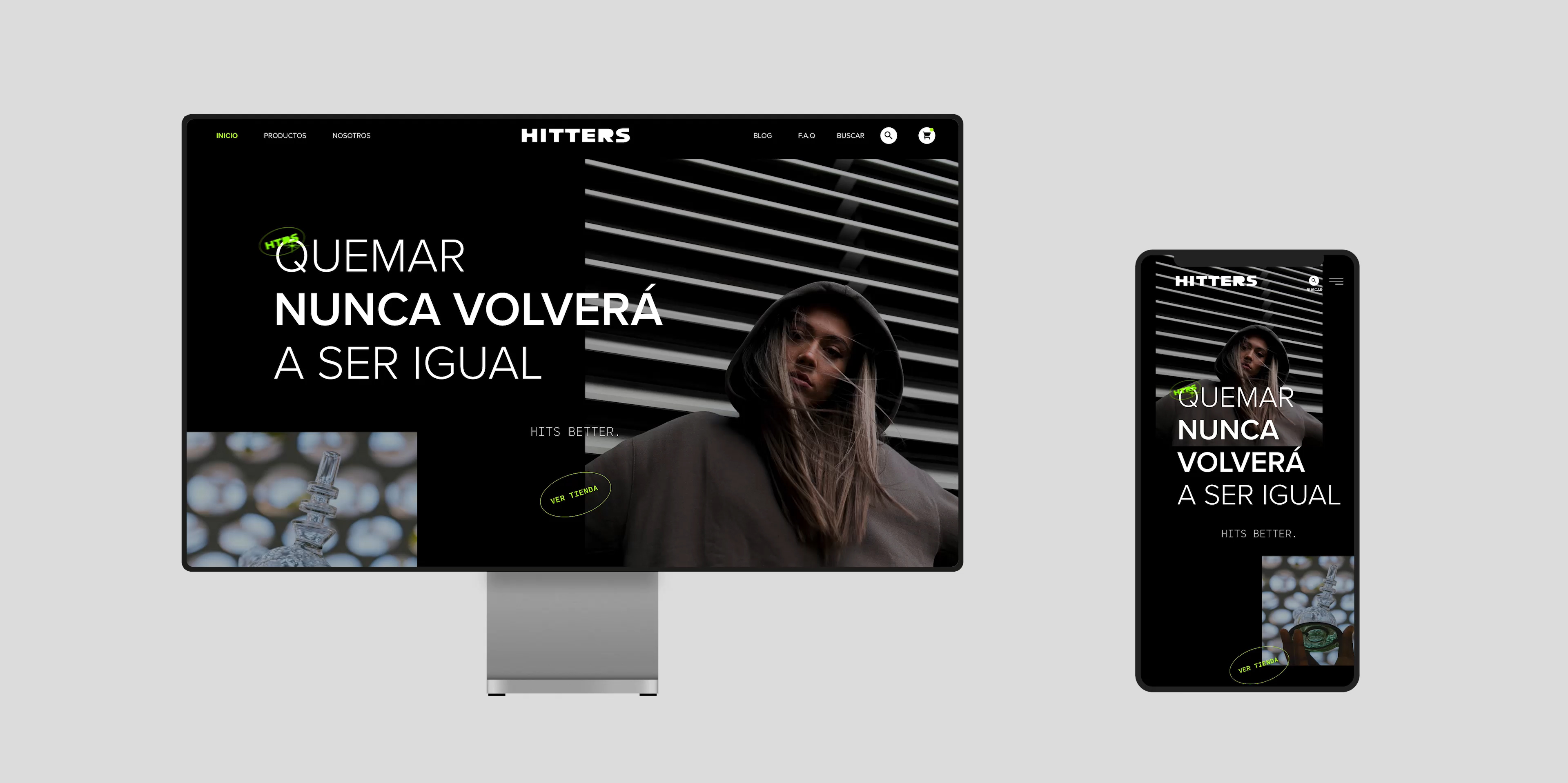
For the digital experience, we designed and hand-coded a custom e-commerce website, combining intuitive navigation and a clear product presentation with Hitters' distinctive visual identity. The result is a cohesive brand experience that connects its strategic foundation with the way customers discover, explore, and purchase its products.