Objective
To develop a brand strategy and visual identity that would differentiate Plus Être from conventional corporate training consultancies, communicating its human-centered philosophy while maintaining the professionalism and credibility required to serve business clients.
Solution
Our strategic process identified an opportunity to position Plus Être at the intersection of organizational coaching and human development. Rather than approaching training exclusively through productivity and business performance, we established a brand direction built around the belief that meaningful organizational change begins with personal growth.
Drawing from the company's philosophical foundations and the meaning behind its name, inspired by the French expression “être plus” (to be more), we defined a brand personality that balances the expertise of a professional consultant with the empathy and approachability of a human development facilitator.
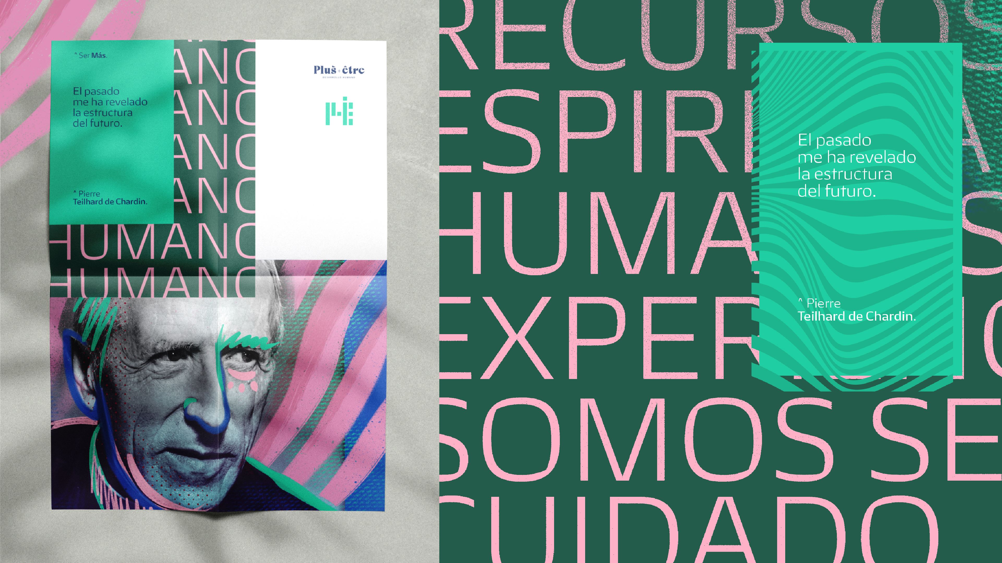
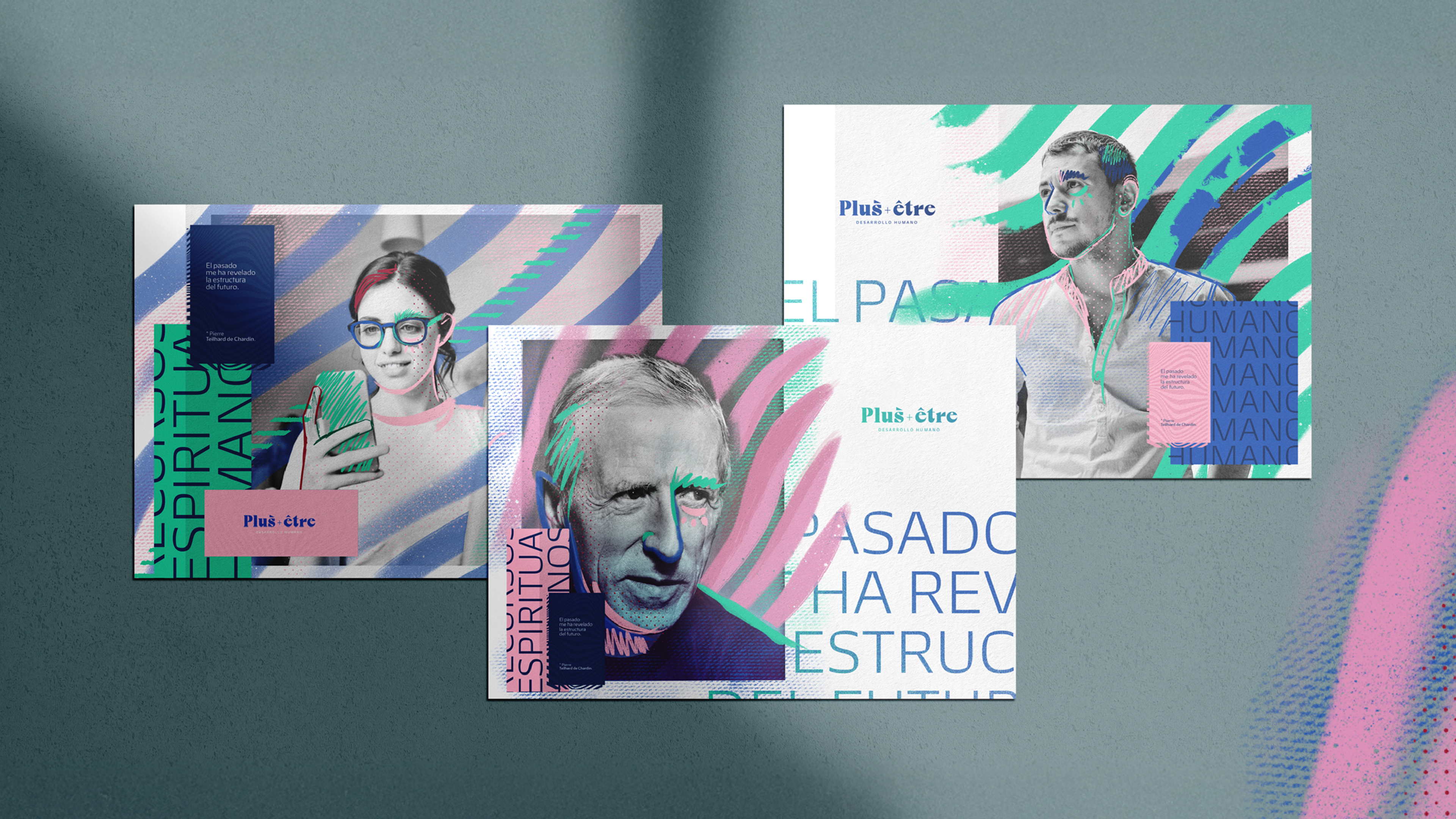
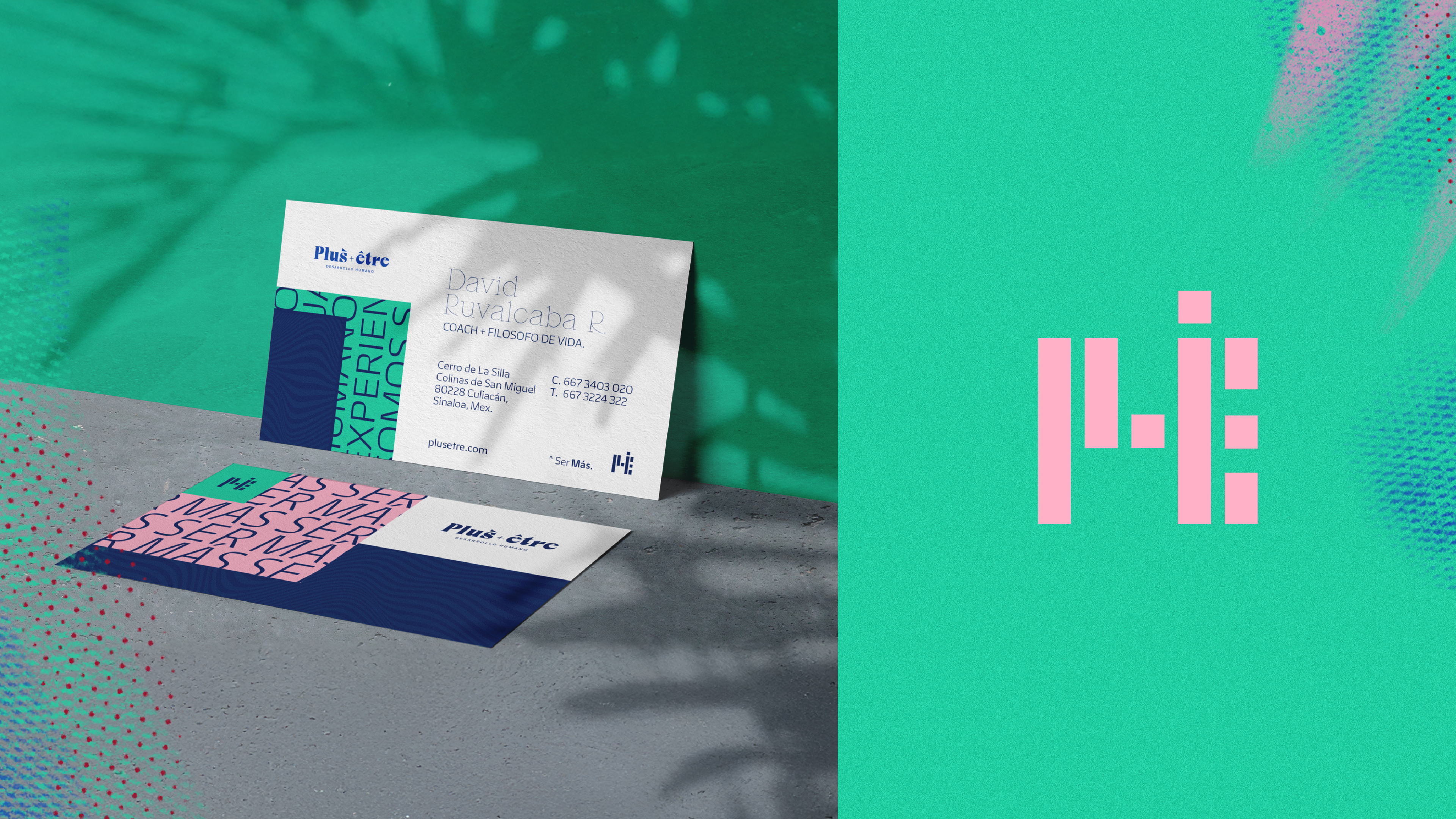
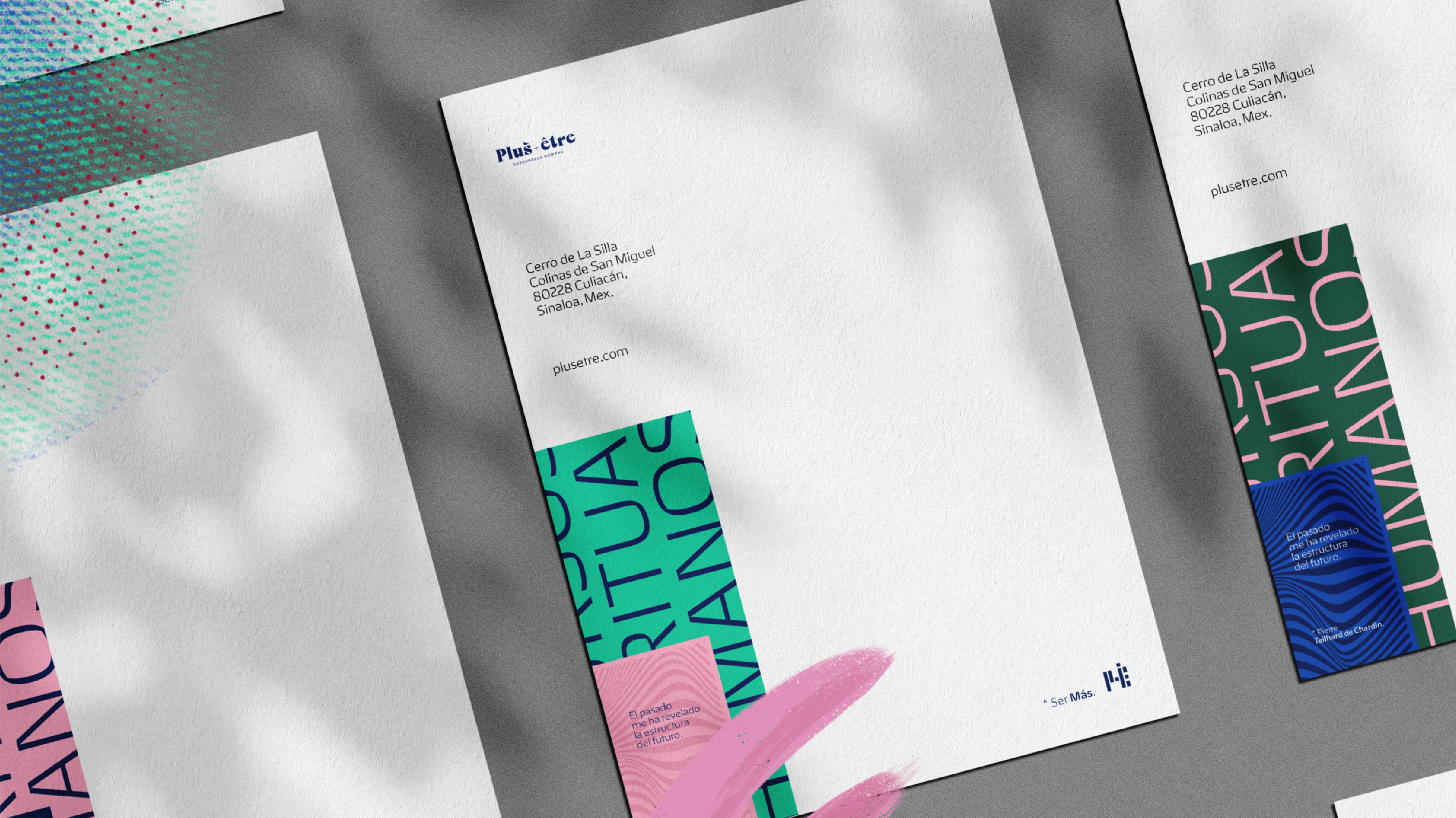
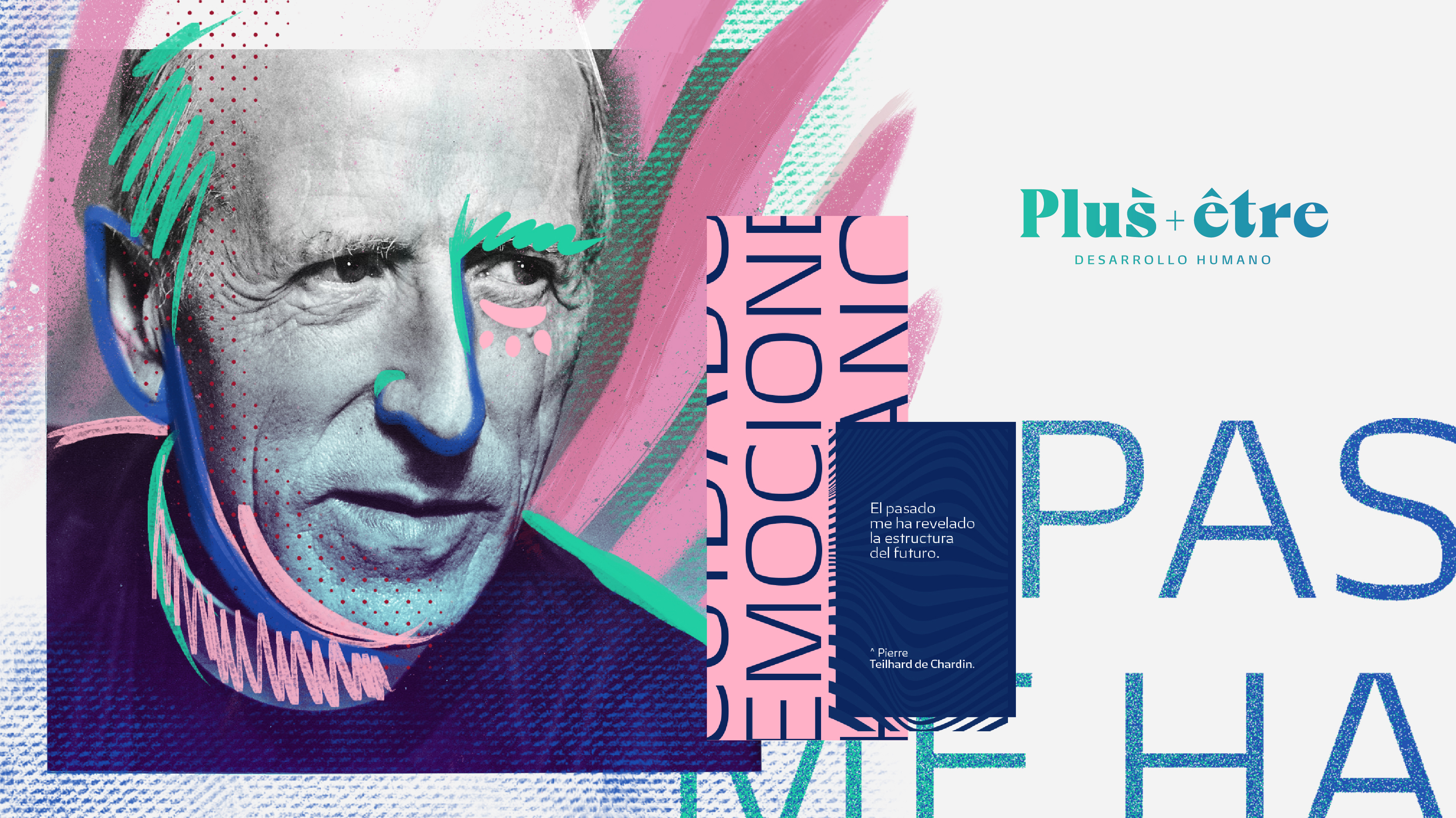
The visual identity translates this duality through a bold serif logotype and a distinctive symbol derived from the letters P and E. Its continuous, interconnected strokes evoke human figures, representing the diversity of individuals that make up an organization. A vibrant color palette and expressive textures contrast with the solidity of the typography, creating a visual language that feels both professional and approachable.
We extended this identity to corporate applications and custom quotation templates, establishing consistent graphic hierarchies and a recognizable presentation for the company's commercial materials. Together, these elements connect Plus Être's organizational expertise with its deeply human approach to personal and professional development.